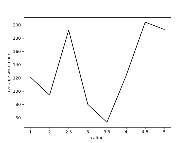
As I was writing some of the reviews for animes which I'd watched long before I had ever considered throwing my shallow opinions of them onto the internet, I realized two things - first was that I enjoyed writing the review a lot more if I hated the anime, and second was that I seemed to be writing far more for those as a result. I immediately assumed that if I plotted this out, it would be an inverse bell curve distribution, with ratings at the extreme ends of the scale measuring at the highest word counts. Well, oh boy howdy was I somewhat-maybe-I-don't-know I-could've-been-but-I-don't-really-know-and-my-data-isn't-good-enough-to-actually-make-conclusions-yet-but-I -still-may-be correct..?
To try and find out if my hunch about the bell curve was correct, I threw together this shitty python script. It grabs word counts and ratings from each entry with Beautiful soup, and then plots them with matplotlib, which I still don't really know how to use. Whenever I need to use matplotlib, I have to resort to the "Random Bullshit Go!" method of getting it to function in the way I want it to. Anyway, take a look at the glorious results:
Clearly, what we are looking at is not a bell curve. It somewhat resembles one, though, at least. The 3 - 3.5 range has the lowest average word count, which makes perfect sense as those are the least remarkable - neither positive nor negative. Approaching higher ratings, the word count climbs dramatically, which again makes sense and resembles the normal distribution/bell curve. Approaching the opposite end, the word count climbs a bit but not so drastically as on the positive side. There is a notable outlier at the 2.5 star rating mark, which is the result of my relatively long rant about Spice and Wolf, which also happens to be the only anime I have yet given a rating of 2.5 stars. Are you seeing the problem here? I don't have nearly enough data to be doing this shit right now. If you look at the X-axis, you'll notice that there isn't even a tick for 1.5 stars, because there's nothing I've scored 1.5 stars. I have a grand total of 27 reviewed animes right now, and so many other factors were influencing the lengths of the reviews that this whole endeavour has zero solid ground to stand on. Or does it? I think there's still a little bit of useless-and-easily-obtainable-through-other-methods information that we can squeeze out here.
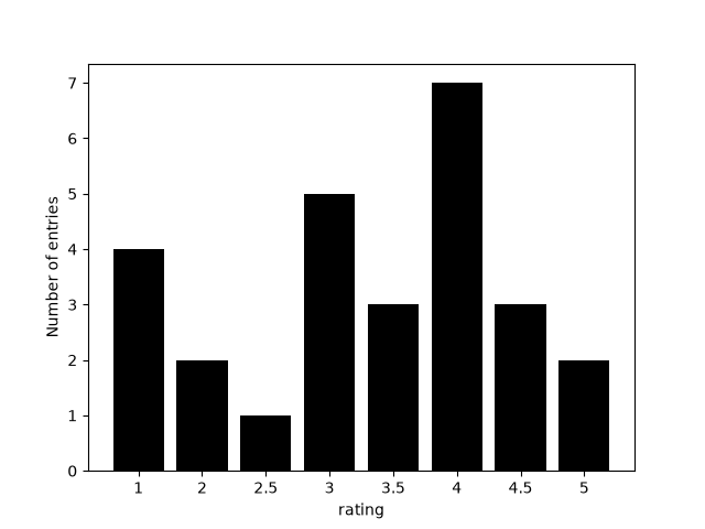
This shows how many entries there are with each rating. If you read my rating chart on the main anime page, you'll know that three stars is supposed to denote 'average'. Here though, the 3 and 3.5 star ratings combined make up 8 of the entries, while the 4 & 4.5 star ratings make up 10 of them. This is easily explainable - more often than not, the anime that I watch is above average, obviously because of my superior taste and intuition. Paradoxically, (no its not?) this ends up meaning that what I thought would be above average (4), is the real average, and what I anticipated as being average (3) is not. Am I expecting people to read my rating chart in the context of its own surroundings, or in the general anime climate, where I may actually give out a 3 to the majority of things? The takeaway here is that my rating system is flawed, as they all are.
And one more thing about the word count not increasing as much on the low end of the scores: This is just because out of the 6 entries that received a score of 2 stars or lower, only 3 of them were written after I decided to be more informative when writing my reviews. Prior to that, if something sucked, I was happy to call it a day with a single sentence shitting on it.
After a long time has passed, (A few years maybe, if I end up sticking with this dumb website hobby) I plan on redoing this little experiment. Maybe then, I'll get that nice normal distribution, which I for some reason want to see my writing conform to.